Wrapped
A look back at the work that shaped Basis Design System this year.
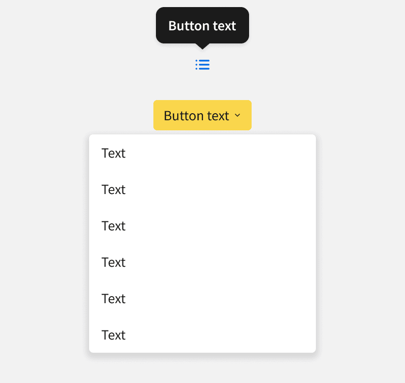
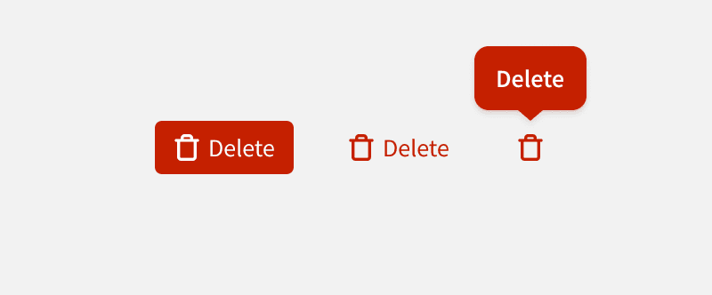
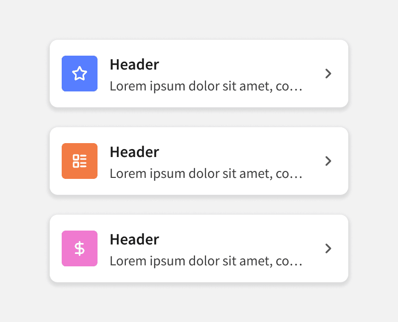
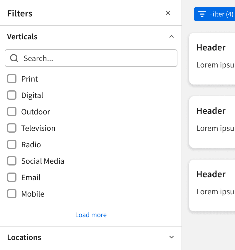
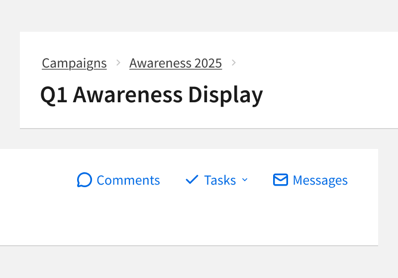
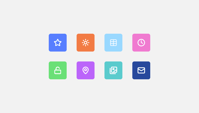
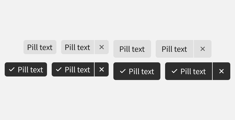
New Components
New Color Variables
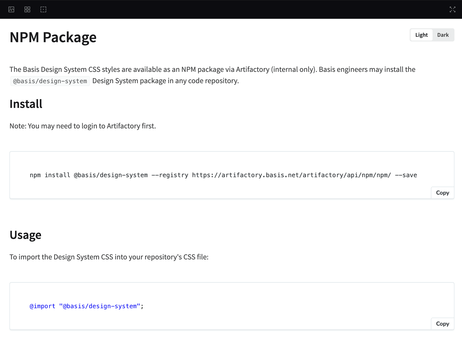
Storybook Docs
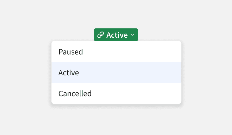
Color Classes Renamed
Design Docs
Color Classes Removed
Figma Designer Stats
Design System 3.0
This was a major revamp of our foundations that will make the design system more intuitive to use and more scalable in the future. We renamed and extended our design system variables and styles. We've also removed a large number of unnecessary styles and introduced a new icon library called "Lucide" icons.
App Drawer Side Navigation
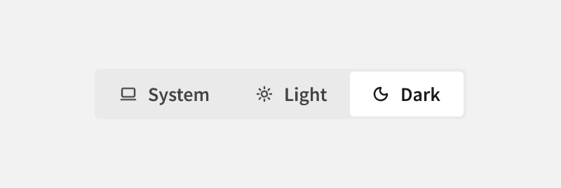
We built upon previous work to refresh the navigation and updated the styles and icons. We also added collapsible sections, moved additional navigation items to the footer, and added a quick color mode toggle to the profile menu.
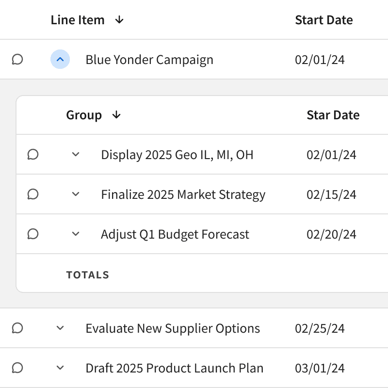
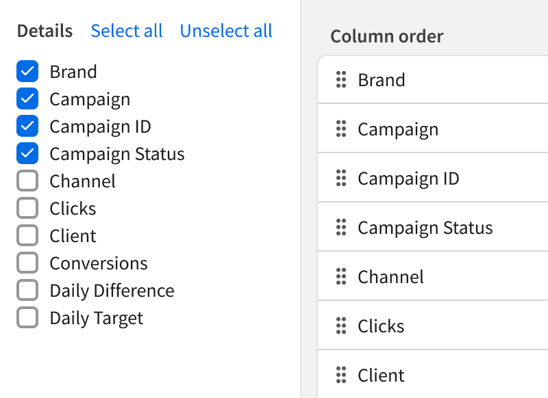
New Data Table in Platform
Toward the beginning of 2025, we released the new, more flexible data table component. We then implemented it on many of the most prominent pages in Basis including campaigns, line items, and analytics.
Design System Updates

New Documentation
" height="48px" id="pSGoD3i6A" transform="translate(5 0)" width="38.51614917566891px"/></svg>)
" height="48px" id="MhjMeyYsI" transform="translate(8 0)" width="32px"/></svg>)
Coming Soon
New Fonts
We will be changing all fonts to Inter. Inter is a versatile, open-source typeface designed to maximize legibility and clarity in user interfaces.
New Shadows
This year we will be updating our shadows to more modern styles. These use "layers" to give the shadows a lighter look and feel while still maintaining a sense of increasing elevation.


Thank You
To our core team and every one of our collaborators: thank you for pushing the boundaries of what our system can achieve. You’ve turned a set of components into a culture of excellence, and we can’t wait to see what we build together next year.